A number of everyday use brands have made a constant place in our homes and we are well familiar with their logos and icons.
In fact, most of us can identify a brand without reading the name, just by having a look at its monograms in the aisles of superstores.
However, despite having a picture of the major brand mascots in our minds, we seldom pay attention to one critical aspect of their design – they are almost always focused on men, with little to no women portrayed on them.
Most of these logos and mascots are being used for decades now.
If we dig deep to know why these logos have no women featured on them, we can tell that back in the days when these things were designed, the advertising industry was male-led, leading to a masculine bias in designing the logos.
Right now, the male brand logos are twice as much as the female ones.
So the big question is, is there any way to promote gender equality in the marketing and promotion of products? Fortunately, the answer is yes.
As we are growing as a species and abolishing the prejudices and gender stereotypes, we can see that the brands are also making an effort to be more gender-neutral in the making of brand mascots.
We can see that women are not limited to the pink color, and men now appear on cooking and cleaning adverts.
Keeping all that in mind, British appliance manufacturer CDA came up with a question: “Is there still a place on our shelves for the older, established brand mascots?”
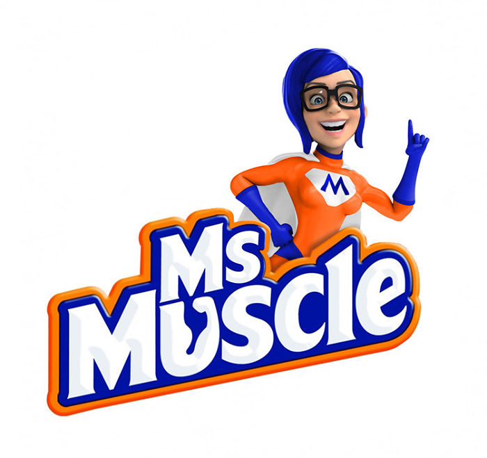
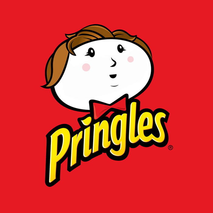
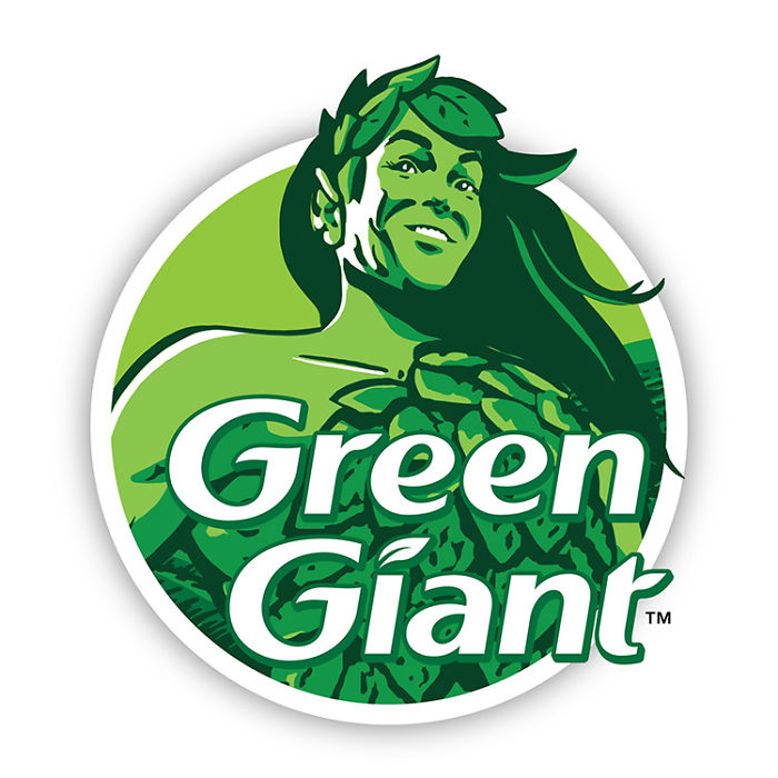
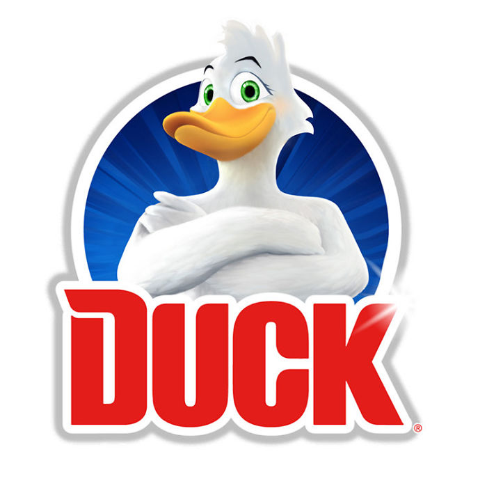
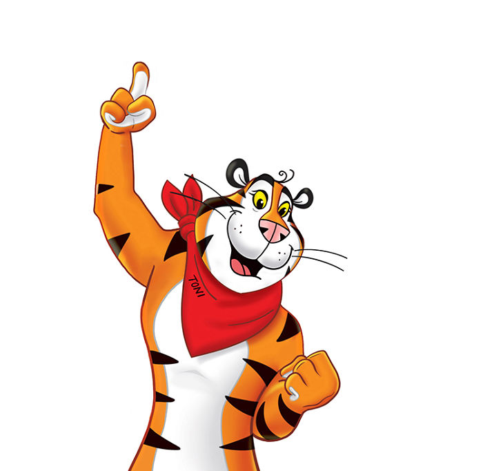
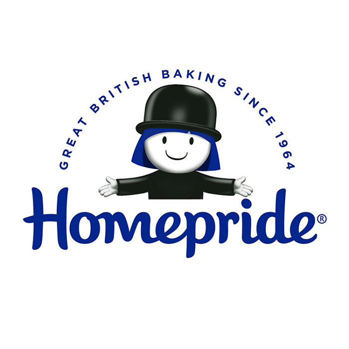
For this women’s day, CDA tried to remodel some of the famous brand mascots by adding a feminine touch to them. Here are some of the modified logos and mascots.
1. Mr. Muscle
2. Pringles – Julius Pringles
3. Green Giant Sweetcorn – The Jolly Green Giant
4. Toilet Duck
5. Kellogg’s Frosted Flakes – Tony the Tiger
6. Homepride – Fred the Flour Grader
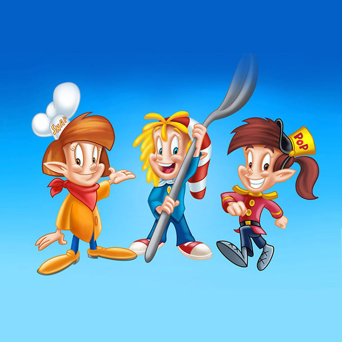
7. Kellogg’s Rice Krispies – Snap, Crackle and Pop
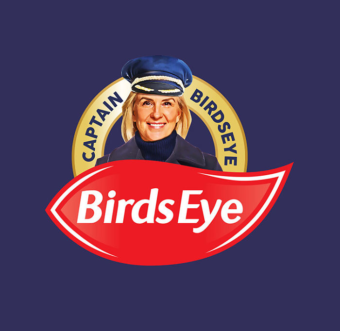
8. Captain Birds Eye
Replaced!
