All the companies try their best to stand out with their logo.
The logo designers put all their efforts to convey the message of the company into the small space of a logo.
But have you ever thought what is the hidden message behind the logos you see in everyday life? If yes then have a look at this article to know about the hidden message in the famous symbols logos.
1. Hope for African Children Initiative
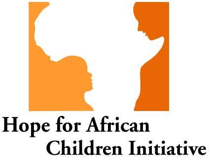
The Hope for African Children Initiative (HACI) was established in 2000 who helps African children ‘’who either have been orphaned by AIDS or live with parents who are sick or dying from AIDS-related illnesses.’’ Take a look at the logo again and you will see an outline of the African continent and the image of the adult and child symbolize the support.
2. Amazon
Apparently, the logo of Amazon had no hidden meaning but the yellow arrow the connects the letters ’A’ and ’Z’, is a hint that this online store has everything to shop for.
3. Formula 1
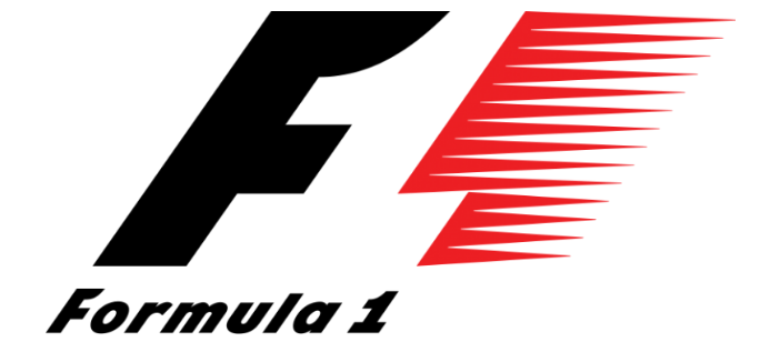
The logo conveys the sense of speed and the white space between the black colored “F” and the red-colored design that signifies 1.
4. BMW
The logo consists of 4 blue and white quadrants which are enclosed within a circle. White and blue colors used for every quadrant symbolize Bavarian Free State. It actually signifies the Bavarian flag, which has a checkered pattern.
5. Apple
Rob Janoff, the man who designed the famous Apple logo, says: ‘’I bought a whole bag of apples, put them in a bowl and made sketches of them for a week, trying to simplify the details. At some point during my artistic experiments, I took a bite from one of the apples. Later that day, to my surprise, I found out that ’bite’ sounds very similar to ’byte’ – a computing term.’’
The size of the bite showed that the shape was an apple.
6. Facebook
The ‘F’ we see stands for word Facebook or symbolization of connecting friends. If you look closely it looks like a human standing with the head down using a mobile phone.
7. NBC
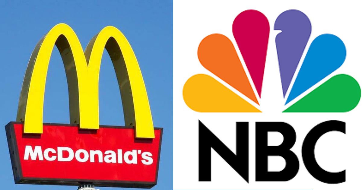
The logo has a hidden peacock above the above text which is looking to the right. It represents the companies motto to look forward and not back. NBC pioneered the production of color TVs and it was owned by RCA.
8. McDonald’s
As we all know M stands for McDonald’s. But according to the design consultant and psychologist Louis Cheskin M also represents a pair of nourishing breasts.
